Saturday, December 9, 2023

William Ekgren's Cosmic Psychadelia, St. John Comics, and Girl Playing Piano

A quick and unplanned post today of a few cover restorations I've done this week along with discoveries (of another historian's discoveries) I've made along the way -

Last weekend, I noticed a colorful if low grade copy of Weird Horrors #7 from 1952 for sale at Heritage Auctions.  I can never afford books at the high end auction sites, but I do like to look at them, and I was instantly reminded at having been struck by Ekgren's covers for St. John when I first encountered them fifteen years ago.  They are so out of place on a comic cover and so intricately wild that comics enthusiasts and art lovers alike stare in wonder.  I took the opportunity to "restore" the auction image and went ahead and found images to work for his other two comics covers.

Weird Horrors #7, April 1953

Strange Terrors, November 1952


 Weird Horrors #6, February 1953

The detailed linework in every inch, the exploding colors, and the mystic wonder and horror make these comic covers unique (the closest contemporary work would be from L.B. Cole whose covers I've also been working on in a gallery here).

When I first encountered Ekgren, I'd read Ken Quattro's sidebar in Alter Ego #77, "Who is WILLIAM EKGREN?" in which he shares his wonder at these covers and describes his intense curiosity at just what the fuck is going on here with these three amazing covers on the St. John comics.  Quattro finds the Larsens, a family, who knew him in New York in the 50s and finds some paintings the family has along with some basic biography.

What I hadn't seen until this week is the amazing follow-up on Ken's blog from back in 2010, A Letter from William Ekgren.  In this absolutely fabulous post (and all this being a great piece of unfolding comics history), Ekgren, amazingly still alive after all those years, reaches out and shares the story of how these paintings became comics covers:

“One day in the Spring of 1952--at the Greenwich Village Outdoor Art Show--three men and a woman were murmuring between themselves looking at one of my paintings…after less than 5 minutes they had bought the publication right to it--for 100 dollars. After a week they gave me the painting back so that I could sell it again…the same procedure came about at the next Outdoor Show (and then the next after that)…the same persons coming back, acting in an almost impolite way and paying 100 dollars for each picture. The editor’s name was Archer St. John (one of the four).”

Marion McDermott (the woman here and Editor at St. John) and Archer had bought these paintings off the street.   Quattro also manages to ask him about rumors of schizophrenia which those who have looked long at these images will understand.  My man was seeing things differently.  Psychedelic is an adjective that gets used, and those who've experimented with substances such as LSD might know there are different realms of perception that might influence art like this.  Ekgren responds:

“About that and that: yes, of course, I’m schizophrenic, thus being more nutty than a fine fruitcake. But thus far I’ve been able to handle this “mental thing” rather nicely, by using ingredients, as well as wholeness, as basic measures giving informative vividness and strength to all my creative activities.”

Fuel for his art. 

But maybe the coolest find for me in this new look at Ekgren is a piece I discovered that sold at Heritage in 2007,  Girl Playing Piano


This piece was sold by someone who had known Ekgren in the early 50s and is very likely contemporary to his comics work.  Absolutely stunning and alive with colorful energy.  Girl on fire, Woo!

Along with the painting, the seller offered two pictures of Ekgren at work.  Art in the streets, we need more of that - what neat photos.


Big, zoomable images of all of these can be seen a Flickr gallery for William Ekgren here.


Wednesday, November 29, 2023

Renovation: Ballyhoo, February 1934 - Mae West Number / More Ballyhoo / Ballyhoo Explosion

 EDIT: I've been looking at this magazine a little more closely lately and have been gathering existing scans of issues as well as scanning some new ones.  Yoc over at the Digital Comics Museum informed me he wanted to put up a section for Ballyhoo and link my blog, so I'm taking the opportunity to get new links and images up for a post in need of repair.  After the refurbished post, I'll add just a couple insights and some new issues.

An issue of a classic American magazine up for your enjoyment, Ballyhoo!


at Flickr

Ballyhoo v06n01 (1934-02.Dell)(Darwination-McCoy).cbr
 

Get the cover to cover scan here.

At the Internet Archive here.

Scan edits for the issue from the one and only McCoy.
  

Ballyhoo was the brainchild of editor Norman Anthony who had pitched the idea to George Delacorte at Dell for a magazine without sponsors, indeed for a magazine that that lampooned Madison avenue and the burgeoning advertising industry. Anthony had been in humor magazines for years and is remembered for always wanting to push the envelope. He'd been an editor for Judge but felt that there was too much pressure from advertisers about propriety. In his short run as editor for Life, he radically altered the magazine, discarding much of the traditional content. With Ballyhoo, he finally got the chance to really change the mold of the American humor magazine

Here is an article in Time from May 11, 1931, in which Delacorte expresses his reservations about the "freshness" of the magazine (Anthony supposedly tried to have some of the initial issue's 150,000 copy pressing wrapped in cellophane, but I'm unsure if any issues were actually shipped this way). Delacorte's reservations quickly evaporated, I'm sure, as the first copy sold out quickly. The magazine was a complete success, exploding in popularity. Theodore Peterson's excellent 1964 book, Magazines in the Twentieth Century, says, "Although the circulation figures are unreliable, the first issue of 150,000 copies was said to have sold out in five days; the second issue sold 450,000 copies, the third 675,000, and the fourth more than 1,000,000. In a few months circulation exceeded 2,000,000." Within a couple years, the circulation would drop back down to about 300,000, but it's 2 million plus circulation mark would not be passed until the 40s with Life and Woman's Day. Advertisers soon pleaded for page space and ads were introduced. It says something that at times it can be difficult to tell between the real and the parody...

The rocketing onto the scene of this magazine seems unique in that it begat a whole craze. Mimicking the readily identifiable patchwork colors of the cover design, clothing makers rushed out dresses, ties, scarves, etc. with the Ballyhoo theme. A book from Simon and Schuster, greeting cards, games, songs and more were produced on the theme, and Anthony even wrote a musical show titled Ballyhoo (which introduced a youn Bob Hope to the stage). A neat piece of trivia for you pinball fans like me out there, the first pinball game had a Ballyhoo theme. You can see it here if you scroll half way down the screen. I can't tell for sure, but it looks like the Bally game company stuck with half of the name of this first machine. And all this talk of faddishness and cultural saturation leads nicely into our covergirl or cover woman, rather, as labeling Mae West as anything but just won't do.

A few nice pics of West, my kind of gal. This first one (a pic of Mae on trial for obscenity for her Broadway show "Sex" in 1927) is taken from a nice review of She Done Him Wrong (1933) over at Lolita's classics (she's also got a review of I'm No Angel also from the year previous the publication of this Mae West issue). The other two, more in a pin-up vein - Mae West had curves in all those places flappers didn't.


In the issue, you get a sense of how big of a sensation West was. She was just everywhere. Her up-front sexuality and disarming wit took the nation by storm and single-handedly had decency groups up-in-arms. And like most fads, perhaps seeing Mae everywhere did get tiresome.  

On the other hand, what's not to like? The gag men bust out the breast jokes en masse for this issue, bawdy humor being a specialty of Ballyhoo . The crude audacity of Ballyhoo is a great surprise, but I think it's done with such a wink and a smile that they were able to get away with much more than other magazines might have.

Steady, men, steady.

Oh my...

at Flickr

A hallmark Ballyhoo two page spread style of five toons with a big one in the center, notice the Minnie parody in the bottom left. 


Ralph Fuller causing a splash at the aquarium

 
The photo gags in here are pretty funny, and you can see how this magazine might have influenced later pubs like Help! and National Lampoon. This page takes aim at the haterz

And also tonight, a bonus issue from the following month, March 1934 - The Clean Number. Involving many plumber's jokes, a lost genre of dirty joke? Russell Patterson cover.

Ballyhoo v06n02 (1934-03. Dell)(D&M).cbr
The scan's here.

at the IA.

Plumber's jokes as noted artists (Picasso, Brinkley, McCay) might do them:

or the Hollywood take


The trophies, C.W. Anderson
 

Big thanks to scanmeister McCoy for the edit work on both of tonight's issues. 


EDIT: New thoughts, new scans below

So, I've been getting the handful of Ballyhoos I've done up at the Internet Archive (there's a link to my shelf on the right hand side of this blog) and also looking more closely at this era of humor magazine with magazines like KooKoo, Wild Cherries, Smokehouse Monthly and others.

With Ballyhoo exploding to a circulation of 2 million almost overnight, you can see how competitors would hope to  hop on the train.  Will Straw has a neat blog post where he posts a lot of these magazines covers here in a post titled United States : The New York Humour Magazine Wave of 1931-1932. Featured are covers for Ballyhoo, Hooey, Boloney, Hokum, Bunk, Slapstick, Hullaballoo, BLAH, and BUSHWA.  There were many more like them.  In the depths of the depression, people needed a laugh.  You can be assured, though, most imitators lost money hoping to duplicate Ballyhoo's novelty and success, but that didn't deter them from trying (and some of these magazines are very good).

One I worked with recently while we're at it, excellent cover design.  A collaboration between Joey Burten and Harry Donenfeld which lasted I believe three issues, here's the second, not a great magazine but sort of an interesting aesthetic. 

at Flickr

.cbr here.

at the IA.

Not a full issue, and quick work from found photos, but another wraparound cover from Bunk v01n01 from Clayton in 1932

Of course, it seems Ballyhoo is the trendsetter here, as some kind soul has put the first issue, August 1931, up at the IA.  The wraparound cover boasts of its freshness and editor Norman Anthony.

But speaking of fresh, I leave you today with a fresh Ballyhoo scan.  I've got a few more to do and a couple I haven't shared on my blog yet.  I've also gathered what issues have been scanned from the Internet Archive (huge props to the unsung IA scanners out there, some of my favorite scanners) and put them in a folder here, as we are starting to get a better record of this fun sensation of a magazine.  Times were hard in The Great Depression and some of the artists from the slicks were taking work where they could get it.  Magazines like Ballyhoo were able to offer a paycheck.

Thanks for the edits on this last one to DaveH, a new partner at Darwin's Free Press who has been helping me with some goldenage comic edits and who will be working with me on some magazines as well.  Here's Ballyhoo from March 1932 with an Ed Graham cover.  Sadly, the issue is missing four pages, but that's pretty common for these Ballyhoos.  People pulled out the gags on the big slick pages (not to mention there might be some nice nudie art that deserved saving, I understand but leave my copies alone you dirty boys!)

.cbr here.

at the IA.

Next time at Darwination Scans, the Columbus Sunday Star, wild, man, wild.

Monday, November 6, 2023

Collier's, May 9th 1931 / What Are You Monkeys Up To?

A quick post tonight of a slick I worked on this weekend.   I hadn't worked a slick in a while and have been trying to get my new refurbished A3 scanner tweaked how I like, so I grabbed a beautiful issue that I've had flattening for the past month since it arrived on my doorstep.  Or rather in my mailbox, but I'll not go down the dark path of beginning a blog post mad at the pickers who fail to sandwich magazines in cardboard so that the mailman can't fold them in the mailbox and have to go to the porch. Put it on a slow boat to China, just pack it sweetly, OK?

Oops, no ranting  

I need a chill pill.  Perhaps these fellows can assist.


Lawson Wood.  This scene reminds me of at least a couple Collier brothers, my namesake.  Get a closer look at Flickr.

Get the Darwination edition of the cover to cover high resolution scan here.

Or you can check it out online or download a .pdf on my shelf at the Internet Archive here.

My grandad had some Collier's covers framed around the house, but never any quite so awesome.  I was always curious about the magazine that carried the family name that sold for a mere nickel, and quite a magazine it is.

I have a couple scans of turn of the century issues here, but this is the first time I've scanned an issue from the thirties.  84 big luscious and slick pages for a nickel, well-printed with generous helpings of color.  Great covers, great authors and illustrators, and other fantastic features - what a production the slicks of the golden age were, and I rate Collier's one of the best. 

And, of course, the engine that drives it all, the well-produced advertisements.  The advertisers paid very high rates so they could reach a large circulation thereby enabling the public to buy the magazine for way below the price of production.  How about that.  And look what excellent things they did with these big pages they've bought and the public's attention:

J.C. Leyendecker, grab your garters, boys

 When's the last time you saw an automobile ad with any real grace?


Lucille Patterson Marsh.  You're watching these children, but maybe one of them is watching you?

Artist unknown, my favorite ad in the issue, for Clicquot Club.  Perhaps I like it as I noticed it incorporates a handle of a fellow magazine scanner.

at Flickr.
 

Advertisers actually making the price of a commodity cheaper?  It doesn't work that way too often now, but I guess that's how we get Youtube and the like.   I used to have great scorn for those that clip out ads from a magazine like this, but I do understand a little bit better as I've come to recognize the artistry of this golden age of advertisement.  In a way, it's not much different from how some of us like to share old ads on Flickr and such places.  But keep your damn scissors away from magazines of such a vintage, eh?

Ha, I said a quick post, but here I am waxing about the ad pages -

Contents!

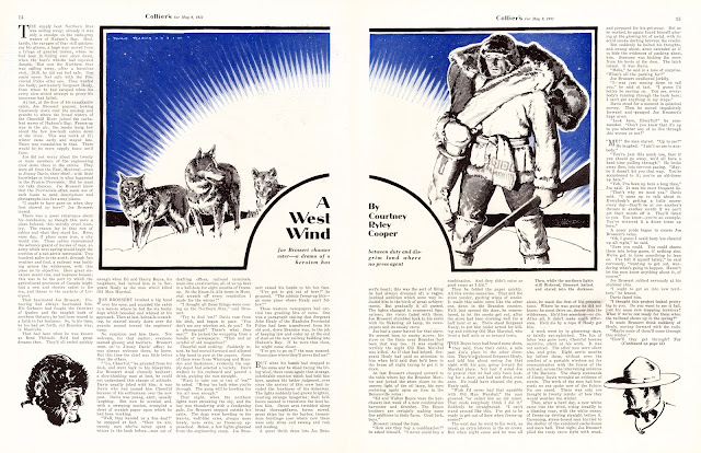
Some samples. Donald Teague illustrates an author some might recognize from his pulp work, Courtney Ryley Cooper, who was later a close friend of J. Edgar Hoover.  The northern sun, have you seen it?

Here Teague illustrates an installment in W.R. Burnett's Protection.  Burnett is most well known for Little Caesar but also penned what would be later classic films like High Sierra and The Asphalt Jungle.

at Flickr

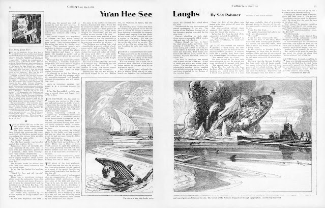
One last splash, John R. Flanagan illustrates Sax Rohmer's Yu'an Hee See Laughs

at Flickr

One more before I hit the racks, Dizzy Dean, I wonder if he'll make it in the big leagues?  But thinking Cardinals right now is making me sad.  What a year this one turned out to be.  But, hey, at least I got see a number of former Cardinals during the postseason on a variety of other teams 😐

at Flickr where you can easily read the page...

The Colliers know how to do it.  See you next time here on Darwin Scans.

Tuesday, October 31, 2023

Wild Cherries v01n02, September 1933 / Worth B. Carnahan, Pt. 5

It's been far too long since I sat down and typed here at Darwination Scans, but I've got a special treat to share tonight, a mouth-puckering offering of the second issue of Worth B. Carnahan's self-published magazine venture, Wild Cherries


Get a better peek at this first prize winning cover at Flickr here

One of my favorite covers by Worth Carnahan, simple but with all sorts of little details to sink your teeth into.  The flapper with short curls in a cute little pink number and silk stockings in white heels adorned with little cherries.  The rolling pin, perhaps used by the baker to keep the suitors away.  The fantastic lettering and logo design.  The price - 25 cents - and worth it! - perhaps a nod toward the hard times that were forcing magazines that had sold for 25 and 35 cents in the flush times of the 20s to drop the price to a mere dime (and often cut corners in production as well).  But life, even in hard times, is just a bowl of cherries upon which it's all perched and in front of a crest design, the shield being a motif and that Carnahan used often in his work and would return to with vigor later in life.

Since last writing here, I've had the good fortune to correspond a bit with Cynthia Carnahan, Worth's youngest daughter.  She was born when Worth was 56 (that's a brave man for you) and carries on the family tradition of artistry from her father and has made a great pen-pal in learning more about the man and his art and later life in Tennessee (where both Cynthia and I reside).  It's totally mind-boggling to me that an artist that was active in the magazines and comics of the 20s and 30s might still have children around today.  My interest in Worth's earliest work has only deepened, and I do intend to step back a little at some point and return to his activities in the mid-20s prior to and contemporaneous with Spice O' Life and his work in the late 20s on Harry Donenfeld's pulps and take a closer look through this lens at Burten's Follies and Artists and Models Magazine, two magazines that are central in the history of the risque urban magazines of the jazz age.

But first, I want to share a couple more publications from here around 1932 and 1933 from when Worth was running his own show and spreading his wings a bit.  Cynthia has provided me a cover for the pamphlet Worth produced during the presidential election of 1932 for Franklin Roosevelt, F.D.R. - The Man, and I plan on sharing a full scan of that soon.  I've also been looking at his work as "The Lone Ranger Stamp Editor" in the first couple issues of Trojan's pulp, The Lone Ranger Magazine and hope to share some neat production material from Worth's time as packager for Bilbara's O.K. comics and celebrate some of his work as a pioneer in the golden age comics of the late 30s in a project for the Digital Comics Museum.

But tonight, a slice of pie, the second issue of Wild Cherries.

You can get the full scan in .cbr format here.

Or it is available for online viewing or download in .pdf format at the Internet Archive here.

The scan gods smiled kindly upon me recently, as I was able to pick the issue up from a picker in England just as I'd been corresponding with Worth's fam.  Sent to me wrapped in a delicate tissue paper, the timing was a great bit of serendipity, not to mention the cover is one of my absolute favorites from Carnahan's career.  When I shared the third issue of Wild Cherries in late Summer, it was met with enthusiasm by vintage magazine fans.  Wild Cherries is funny.  And frank.  Who knew grandma and grandpa were busting out the dirty jokes, eh?  And as a student of risque and spicy mags, I do find Wild Cherries to have a particular flavor.  There's a directness in the humor that is refreshing and direct.  Sure the jokes are dirty but with a wink and delivered with class.  We're all naughty, rich and poor, dim and bright, and, let's face it, sex is likely the greatest motivator in all of human behavior, so you might as well have a laugh at it, eh? But enough of the pontificating from yours truly, let's crack the issue open and have a look.

A new day, the inside front cover - red, white, and blue.

 at Flickr

Emerging from The Great Depression, there was initially an enormous optimism about a new day in American industry and American life.  There was an idea that Roosevelt might usher in balanced economic system fair to the worker and small business alike that would set aside the iniquities that many American's blamed for their economic hardships of the day. The National Recovery Administration's blue eagle featured as a stamp on many magazines of this exact time period, but Carnahan has given the program his most enthusiastic support by placing the eagle front and center upon opening his magazine.  I'll likely get into some thoughts on Roosevelt and the good and bad legacies of his policies when I share F.D.R. - The Man but for now I just want to celebrate the optimism.  The can-do.  The sense of unity behind it and the willingness to do your part. Hear, hear, Americans.

The editor's page (and also the publisher's page as the case may be)

Here Worth espouses "spicy but clean fun" art and plenty of laughs.  He's also looking for input and engagement.  A new magazine must quickly discover what readers do and don't like and adjust.  Also, you see Worth handling a side perhaps he hasn't handled so much in the past as publisher, submissions from would-be contributors.

The contents page, promising peppy pages, really clever jokes, and that lightning rod of magazine success, novelty.  Not to mention Worth hoping for some three dollar yearly subscribers.

The opening cartoon, fitting for a magazine of sex humor, Samson and Delilah, the battle of the sexes eternal writ in the slang of the 30s

at Flickr

There may be only one way to keep your man from straying says the help


 A Carnahan flapper up a tree.  You can climb up, but can you get back down?

I still haven't identified this cartoonist.  I know he worked in the Calgary Eye-Opener as well but have failed to get a name to go with the crazy signature.  I like the idea behind this one:

at Flickr


Carnahan, About to Be Embarrassed

at Flickr

For the birds


Now you tell one!  Jokes and wine. 

Selling blushes

Bruce Patterson, egad

at Flickr

Who says the British lack a sense of humour? 

From the mailbag, lovers of the magazine?  Naughty but not too naughty?  I'm going to skip any theorizing here why Wild Cherries didn't make it and save it for if I ever find copies of the other two issues.  Many great magazines lived a short life for all sorts of different reasons.  The magazine market here in 1933 was tumultuous and crowded, a quarter was hard to come by, and a new publisher might not have the strong arm of more established syndicates behind them.  Enjoy the wild cherries when in blossom.

And, in closing, the back cover, more red, white, and blue.  Attention AMERICA.  The Last Word in Clean Spicy Humor.

at Flickr